Information on Dave's home page
HISTORY
This site was originally put online at eskimo.com in about 1996 (possibly 1995?), when my user name was "Gopher". I called the site "Gopher's Hole in the Ground". It was a single page with a black-on-gray background texture that made reading the text difficult. When I moved to oz.net, I changed the website look and used a plain white background, but the layout was still mainly one long, single page.
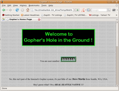
The original "Gopher's Hole in the Ground" welcome screen on Eskimo.com
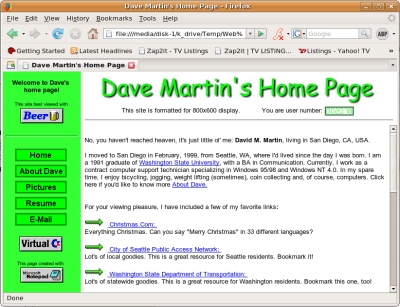
The 2001 oz.net webpage, after the 3-frame look was made, but before the goofy buttons were added.
The subsequent generation included three frames, much like it is now:
A "sidebar" on the left, in green, was always
present and contained links to each of the different major elements of the site ("About Dave", "Pictures", etc.).
A "titlebar" on the top was my banner, with the page's title, a hit counter and a warning regarding the 800x600
format for the site. The titlebar, like the sidebar, was always present.
The "home-in" section was the only frame that was "dynamic". No matter what internal link you clicked, the content appeared in this frame. The first page of content you saw was my "home" page, which had an image containing buttons for each of the site's major elements. They functioned identical to the corresponding buttons on the sidebar, but were big, green and had little pictures matching their function (the "E-mail" button had a mailbox, the "Links" button had a few chainlinks, etc. My favorite was the picture for "About Dave" which was a silly looking face with it's tongue sticking out.)
The original goal of these frames was to create a television-like feel, with all content appearing in the "screen", but I never stuck with the goal long enough to learn how to create a channel-selector. Oy, that would have taken lots of skill.
In early 2002, I changed the sidebar to include a gradient-scale of the green coloring, and made the buttons look a bit better, and also improved the look of the big, green buttons on the first home-in screen.
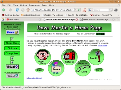
The 2002 version of my website's home screen
In February, 2003, fresh out of work, I decided to read up on the newer versions of HTML (the programming/scripting language of web pages). I got a book called "Beginning XHTML" and started a complete makeover of the site's look. I kept the three-frame format look, but changed the color scheme to a monotone tan with dark purple highlights and medium-brown text. I also added a fourth frame - a mere 5 pixels high - which builds the darker colored border at the bottom of the "home-in" frame. I don't know how long I'll keep this look, cuz it's a bit boring. But it serves my desire to have a more conservative look. (No more tongue sticking out, though. Darn!) I decided to continue with the 800x600 format, since most people use that resolution on their monitors. The entire site forms identically on higher resolution monitors because I included very strict margins, borders and frame sizes. The sight went live on February 13, 2003.
XHTML, CASCADING STYLE SHEETS, INTERNET EXPLORER'S FRAMES PROBLEM
AND OTHER BROWSER COMPATIBILITY PROBLEMS
This site mostly complies with XHTML 1.0-Transitional. The "transitional" reference means that while it complies with XHTML rules, it also contains language that allows older web browsers to properly display the content and look. As XHTML moves farther away from "transitional" to "strict", older browsers will slowly lose their ability to properly display (or "render") the pages. But I'm not going to worry about that now.
Cascading Style Sheets (CSS) made text formatting much easier. Rather than having to put formatting information for each paragraph of content, I simply use a pre-formatted "template" (a style sheet) to provide the format. In other words, I used to have to tell each individual paragraph to "display this text with the "Arial" font, with a font size of 10 and a font color of "black" and align it to the left". Now all I have to do is define each paragraph as a "paragraph" and the browser will use the "paragraph" formatting instructions provided in a template! Makes for much less typing!
There are a few areas that I was unable to maintain compliance with XHTML 1.0: the frames. When I used required XHTML to produce the three frames, I was unable to get rid of the frame borders despite having language that removed them. So, I included some non-compliant language from the older HTML 3.2 that forced the removal of the borders. The display is not perfectly on Mozilla and Netscape 6.0+ browsers. However, Microsoft Internet Explorer, while properly removing the borders, still persists with a 2 pixel-wide "white space" between each of the frames. This makes the website look like 4 separate rectanglar "slabs" that aren't lined-up properly. Blahhhh!
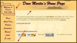
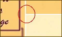
Red arrows in the first picture point to the border that Internet Explorer incorrectly places around frames.
The second picture shows a close-up of the problem. Those white areas should not be there!
(This is approximately what the website looked like in 2/2003.)
My code also loses compliance with the "embedded" sound in the Virtual C=64 page. The "official" way to embed sound in XHTML 1.0 is with the "object" element. However, Internet Explorer didn't play the sound properly, so on the recommendation of the reference book I'm using, I went with the "embed" element, which works fine on Mozilla and Internet Explorer.
Not satisfied with the frame rendering problems with Internet Explorer, I set myself on learning more about Cascading Style Sheets in the hopes that it would save me. I knew about CSS's ability to position objects with an "absolute" setting and saw that this was used effectively on professional websites. After spending another three days figuring out absolute positioning, I finally got it working! I updated the entire site (again) on March 10, 2003. NO frames! The site looks identical on either Mozilla or Internet Explorer, and there are no more lines separating the "frames". I'm using what professionals call "boxes", positioned to exact pixel locations on the screen.
Even with the "no frames" CSS working great, I still ran into browser compatibility issues between Mozilla and Internet Explorer. This time the problem was with simple borders. When Internet Explorer draws a border around an object, it draws the border on the inside edge of the object. Mozilla draws the border on the outside edge of the object. Ack! So, in order to fix that problem, I had to manually add "boxes" to be borders on the right and bottom of the "Home-in" box. So, rather than 3-4 frames, I now had 5 boxes: the left sidebar, the titlebar, the "Home-in" section, the "Home-in bottom border" and the "Home-in right border". This worked great!
For about a week in late March, 2003, this website complied with XHTML 1.1, which is a slightly tougher standard than XHTML 1.0-Strict. Every page was tested and complied with XHTML 1.1. However, I wanted to add an element to the site that involved the placement of random images on the titlebar. The Javascript portion of the code worded fine. Unfortunately, calling the image to be placed on the screen required a command that one browser understood, but two others didn't. Mozilla understood the command as required under XHTML 1.1 standards, but Internet Explorer and Opera 7.03 still used an older command and ignored the XHTML 1.1 command. (re: "name" vs "id") So, I faced a choice: allow all folks using any of the three above browsers to view the random image -- but lose the XMTML 1.1 compliance - or maintain compliance with XHTML 1.1 but ensure that folks with Opera or Internet Explorer would not see the random image. Knowing that most people use Internet Explorer, the choice was simple: I went with the wider audience possibility. I lowered the website back to XHTML 1.0-Transitional and swallowed my pride. XHTML 1.1 is still in the testing phase anyway, so it's not like I'm behind the times. But it would have been nice to be on the cutting edge of something. :-)
I'm not sure exactly when, but by late March or April of 2003, I had the page completed in such a way that would last at least until early 2007 (date of this particular paragraph edit). There are still three main frames, but with all CSS formatting, the borders and other elements are no longer separate frames. The top frame now stretches the entire width of the page. On the right-hand side of the top frame is a section for a random picture. The randomness is provided by a script written by someone on the web whom I don't recall. The sidebar frame is still on the left, and the main, or "home-in" frame is on the lower right. The corners of all inner sections (left sidebar, home-in section and the random picture) are all rounded -- thanks to CSS and little "corners" I made in Paint Shop Pro. The webpages are all several layers thick, so some elements are partially covered (like the corners of the pictures are covered by the "rounded corner" GIFs, and also, the home-in section has a watermark of trees silhouetted against a sunset).
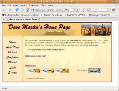
How the website looks in early 2007
MOVE TO YEAHBLAH.COM/.US
In November, 2004, I found a good deal on domain names and hosting services through GoDaddy.com. I decided to buy yeahblah.us and yeahblah.com. By December, I had moved this website to yeahblah.com and posted a "we're-closed" warning on oz.net, advising viewers of the new location and to update their Favorites. (Not that I have all that many viewers...) yeahblah.com is the main site, with yeahblah.us merely sitting there with a redirect to yeahblah.com. My oz.net account, which I'd had since about 1996, was closed in ~August, 2005.
On October 26, 2009, I bought and added yougunky.com, and had that domain forwarded to yeahblah.com. This was after consulting www.uspto.gov to make sure nobody else had a claim. Hmmmm....
FUTURE DIRECTIONS
In the future, I'm planning to have no visual display at all. Rather, one will simply "think" about my website, and all current content will download into his/her brain. I'm gonna have to wait for technology to catch up with me though.
XHTML: © 1996-2009 David M. Martin